skip to main |
skip to sidebar
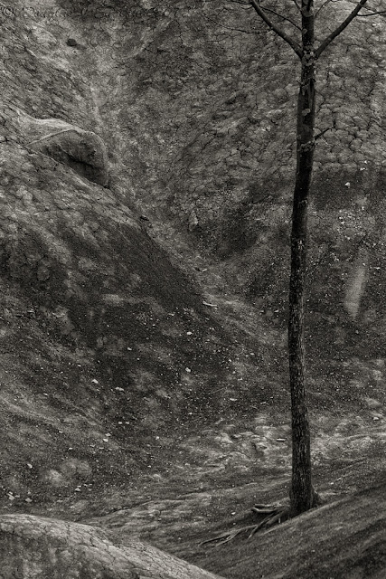
Photo of the Week 2012-05-07
... continuing with my exploration of warmtone monochrome images, I recalled a podcast from Lenswork, the excellent podcast by Brooks Jensen, fine art photographer, publisher and visual artist. In the podcast, Brooks explained that warmtoned images appear more three dimensional when compared to images with a neutral tone. He referenced a survey, that I have yet to find online, stating that two thirds of people see warmtone images as having a three dimensional quality not present in images using other toning hues such as neutral, selenium etc.
 |
| decimated | | | | |
I'm not entirely certain that I would say I find warmtone images more three dimensional, but I do find the resulting images quite pleasing and quite like the result. Perhaps I am in the one third, or I have not seen enough comparative examples to this point. One thing I know, I will continue to experiment with warmtone on my photographic journey.
DJE


No comments:
Post a Comment